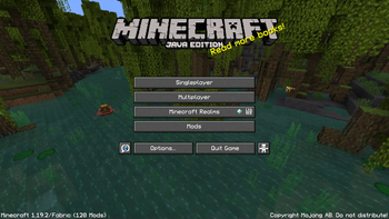
The font for the 1080p everyman. Finally.
Let's face it. Most gamers have 1080p monitors. Whether it's a standalone screen or it's built into your laptop, 1080p is still the most common monitor resolution today, and this creates an interesting issue in Minecraft.
Anyone who's looked at Minecraft's Video Settings menu for more than 5 seconds has come across the GUI Scale option. And as my friends and I can attest, any savvy user who has a 1080p monitor will agree: at 1080p, a GUI Scale of 3 looks the best.
GUI Scale 2 ends up looking too small. GUI Scale 4 ends up too big, and screen real estate begins to dwindle. But herein lies the issue: if GUI Scale 3 reigns supreme, why are there so few 48x resource packs?

(By the way! If you like 3x Font but are upgrading to a 1440p monitor, check out 4x Font!)
Powers of Two vs. Multiples of 16
To make a long story short, the community of people who create Minecraft resource packs got addicted to the Powers of Two. It is therefore easy to find resource packs that are 8x, 16x, 32x, 64x, 128x, or even larger. But Minecraft's GUI Scale setting doesn't operate on Powers of Two. It operates on Multiples of 16.
Minecraft's default, inbuilt textures are 16x16 pixels, commonly abbreviated to 16x. When you adjust the GUI Scale setting, you're actually selecting an integer multiple of 16x for the display scale of all GUI menus, buttons, and text.
1 times 16 = 16x. The default, the familiar.
2 times 16 = 32x. Double the resolution of the default! Faithful is a great longstanding example.
4 times 16 = 64x. Quadruple the resolution of the default!! VanillaXBR is an example I actually use myself.
But wait, we've skipped something. We're not Valve. We know how to count, right?
3 times 16 = 48x. Even though this totally works in-game, 48x gets extremely little community recognition.
It's true, very few folks make any 48x packs. Heck, Modrinth doesn't even have a category for 48x, making it difficult to advertise such a pack. UPDATE: If anyone is reading this sentence after December 8th, 2022, you might have noticed that this pack has been marked with the 48x resolution tag. I'd like to thank Emma (triphora) on the Modrinth Discord for responding quickly and amicably to my request that this new tag be added.
As of the same date, PlanetMinecraft still has no 48x category. Moreover, PlanetMinecraft still calls them "Texture Packs." It's literally all over their website. Obviously, they must be entirely staffed by idiots. They are called RESOURCE PACKS. They have been called Resource Packs since the launch of Minecraft 1.6, all the way back in 2013. You know it, I know it, and Modrinth (thank goodness) knows it. I'm never posting anything on PlanetMinecraft ever again.
Why would anyone want a 48x pack?
Well, how does Minecraft handle a mismatch between the scale of your resource pack and your GUI Scale setting? Pretty much the easiest way they could: nearest-neighbor image scaling.
Now, Minecraft's default 16x textures can be easily upscaled to 32x, 48x, or 64x as dictated by the GUI Scale. They're all multiples of 16, after all. But what if you have a 32x or 64x pack installed? What happens then? Let's take a look.
Why a 32x pack doesn't work
Here's Faithful at its native GUI Scale of 2:

Here's Faithful again, at GUI Scale 3:

As you can see, 32x textures cannot be cleanly upscaled to 48x. Artifacts appear due to the non-integer transformation.
Why a 64x pack doesn't work
Here's VanillaXBR at its native GUI Scale of 4:

Here's VanillaXBR again, at GUI Scale 3:

The transformation from 64x to 48x is even worse. Pixels have to be thrown out to perform nearest-neighbor downscaling, resulting in horrendous artifacts. These characters look like they were chewed up by a dog.
Finally, a 48x font
If I were to attempt to create an entire 48x pack, redoing every texture in the game, I'd likely end up working on the project forever. And that's if I don't go nuts in the process.


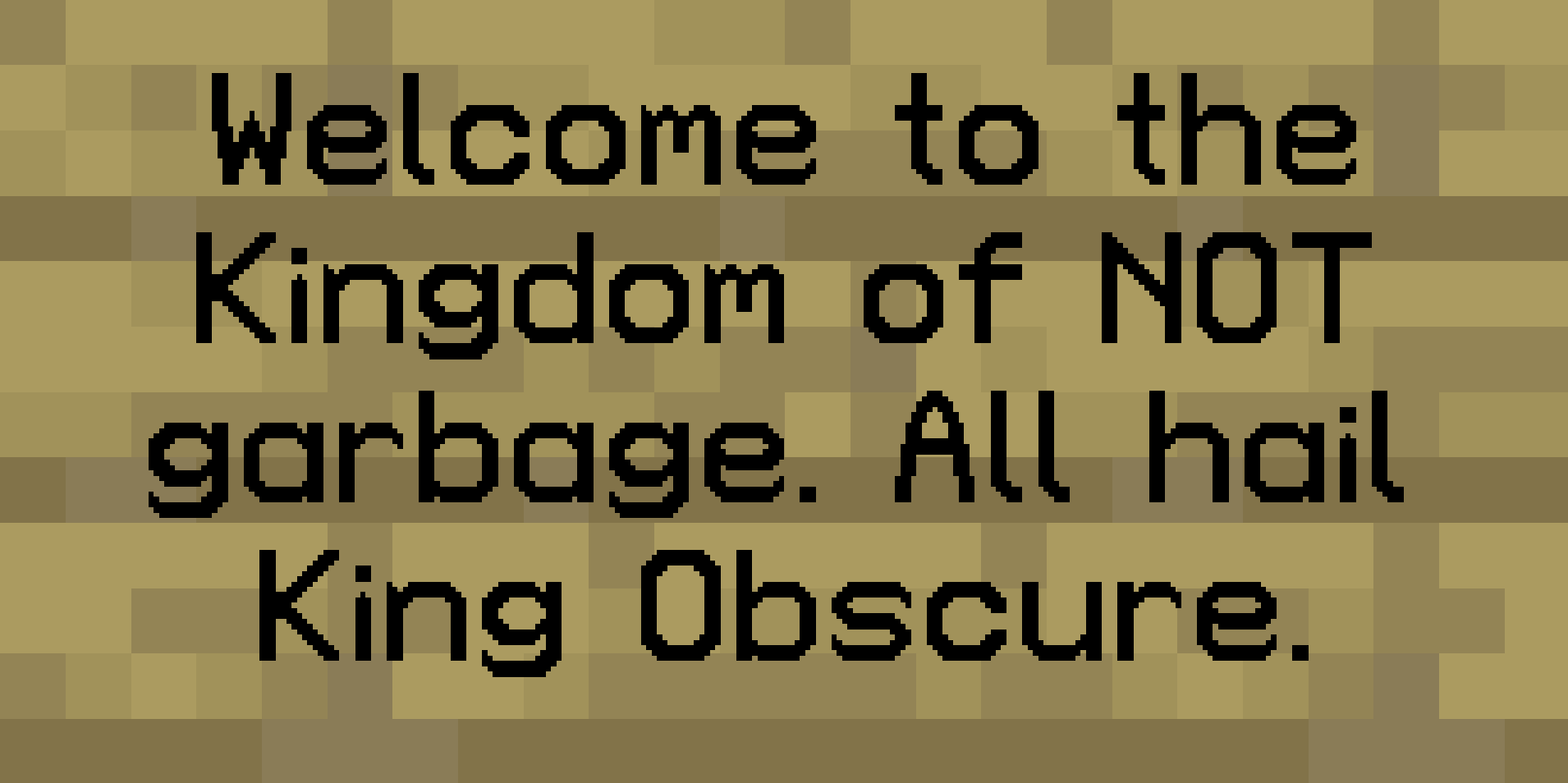
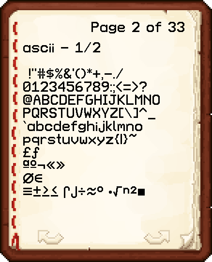
I have taken it upon myself to improve the lives of all brethren of the church of GUI Scale 3 by creating a new and improved font actually designed to look good at GUI Scale 3.
This font is not a Vanilla imitation or interpretation, but rather a revamp according to my own tastes. And boy does it look good in-game.

Progress
As of Version 1.1, only basic ASCII has been completed. Future versions will include support for accented characters and nonlatin European characters. I also plan to implement the "replace SGA with English characters" modification just for fun.
