
📖 About:
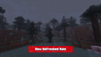
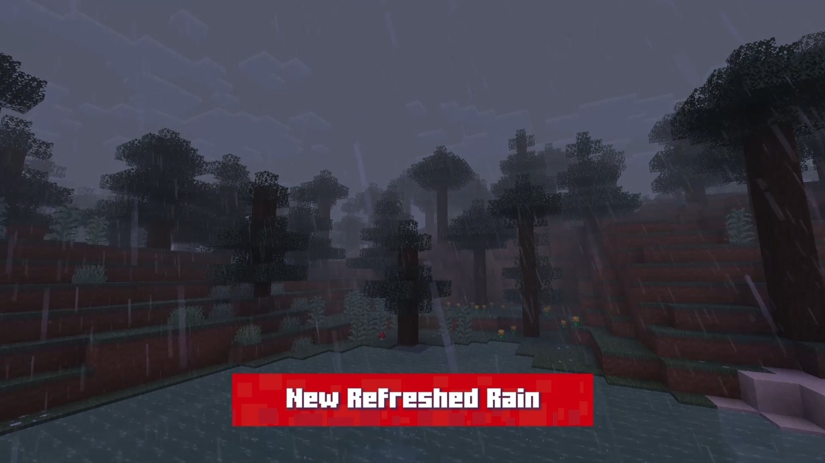
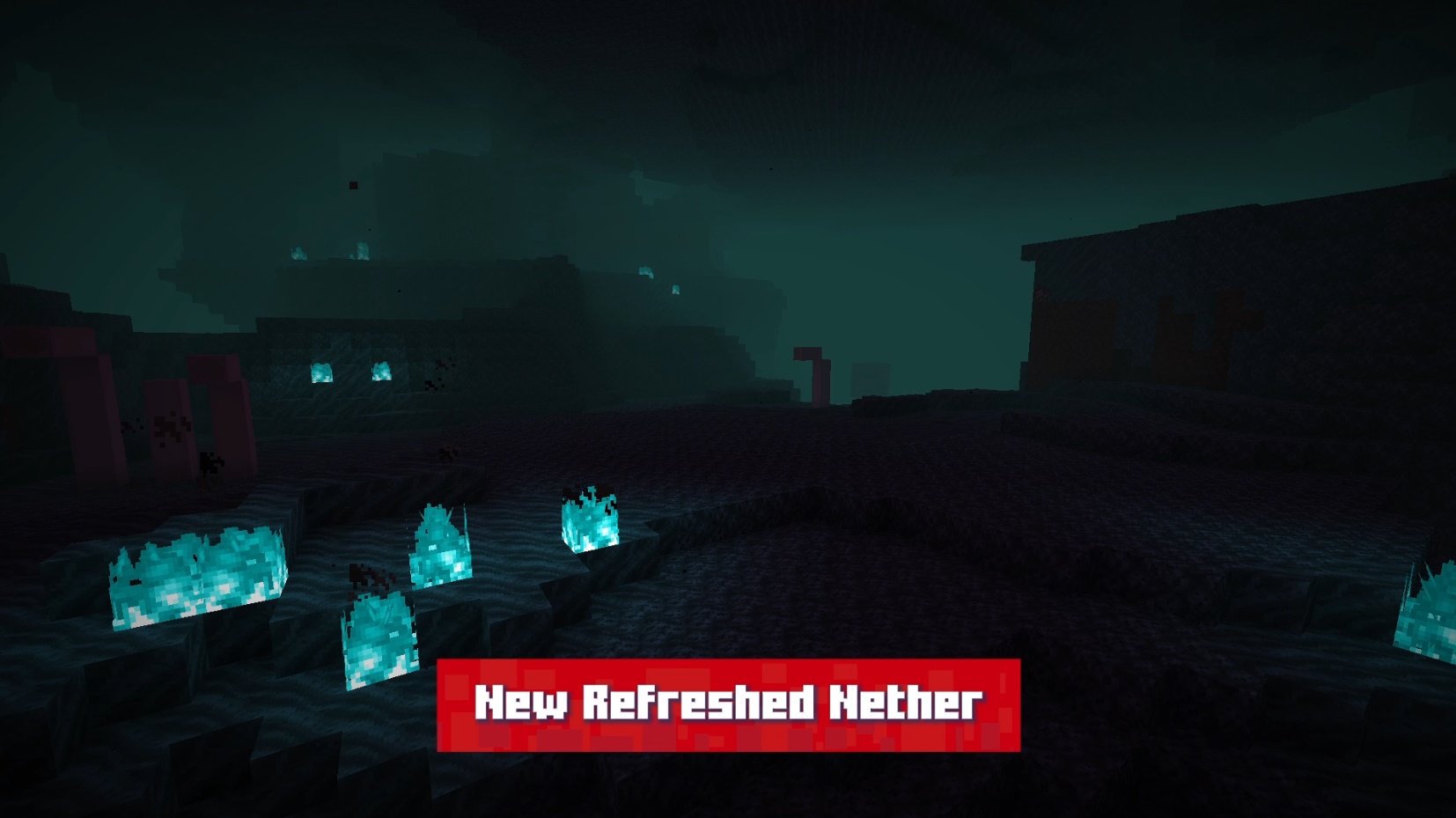
Refreshed! It's my vision of what Minecraft would be like with more improved textures and focused on visibility. In my point of view, many of Minecraft's textures are full of "noise" and this really bothers my playing experience. So I made this texture precisely for that, many of Minecraft's new textures have already improved a lot in this aspect, bringing more advanced techniques like hue shifting and a limited palette, without using noise in the textures. so i followed this new standard for Minecraft!
Some other things also have my creative freedom, like the concept of the birch being more of an "autumn" location instead of just another green biome in the game. The resourcepack is still in progress, and many more textures and models will be added and updated! Hope you like it !

🎞️ Trailer:
 🖼️ Some Images:
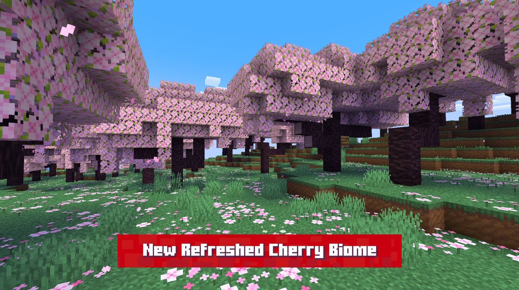
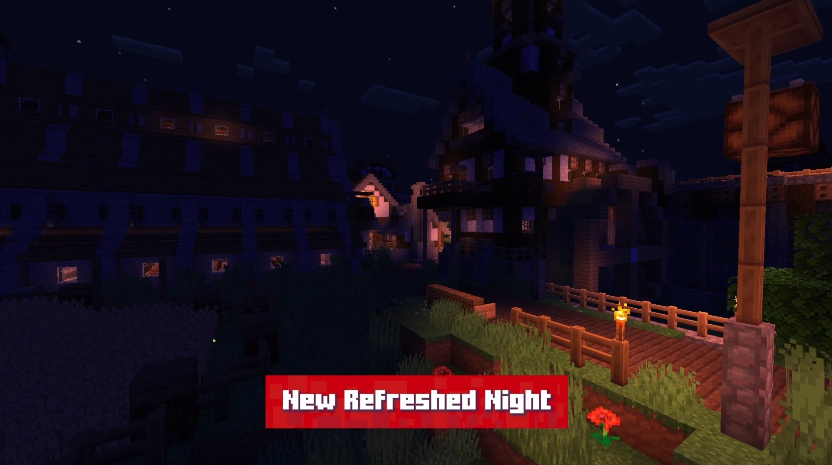
Thank you very much ❤️ !
